Monday, 24 February 2014
Saturday, 22 February 2014
Friday, 21 February 2014
Wednesday, 19 February 2014
Tuesday, 18 February 2014
Sunday, 16 February 2014
Day 85 : Which slogan did our audience prefer? (audience research)
Introduction
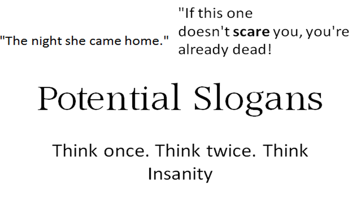
Me and Priscilla came up with several slogans and asked those aged between 19-16 which slogans they would prefer to feature on our poster and tickets for the premiere of our final trailer. Doing research enables to gain a deeper understanding of our audience, as our products must entertain and please them, as the our product would have no purpose without an audience to target towards pleasing.
Me and Priscilla created a brainstorm on different slogans to feature on our poster and tickets, using inspiration from other films for example "The night she came home" is inspired by Mychael from Halloween. As it is originally "The night he came home". We thought this was extremely effective however we wanted our target audience to be the ones who decide. Lastly we decided to make the slogan on the poster and ticket different as we wanted something more simple yet effective, as unlike the poster who is drawing an audience the tickets are given to those who already express an interest in our film.
Here are the tickets and poster we created for our trailer premiere. When creating the poster we made sure to make it simple so that the those interested could straight away see what time trailers will be being shown, the use of our poster enables us to reinforce elements of our narrative to our audience so they know what it's about, the use of red is eye catching and bold along with the slogan which gets the audience thinking as well as our branded logo as they become curious to why our films called "Insanity". These aspects are also incorporated on the tickets which are overall conventional in terms of including the film name and time, however we choose to subvert with the use of a slogan to maintain a link between the poster and tickets so that the audience remember our trailer from others. (slogan makes it more recognizable)


Conclusion
The video below presents me and Priscilla talking about our trailer premier in terms of what we learnt and our developed understanding on how our audience viewed our trailer.
Friday, 14 February 2014
Day 84 part 2 : Analysing Final Poster & Magazine


Introduction
Last week having finished the production process of our trailer, poster and magazine we decided to do an analysis of every aspect of the magazine and poster in terms of conventions, colour, text and what aspects attracts the readers/audience as well as comparing it to real media texts.
Our analysis is presented in a spider diagram below.


Conclusion
Our final poster and magazine share similarities and differences with real media texts in terms of camera shots, effects used in post production, whether it is portrait or landscape and font style, size and colour. Analysing our final pieces and comparing them to real media texts made me realise that every piece of text, colours used, shot or angle and imagery all reinforce elements of the film and narrative. For example in the poster for "The Children" the slogan says "You brought them into the world. They'll take you out" which straight away tells the viewer that the narrative is going to be centered around evil children. This is similar to our poster where are slogan says "she's just a little girl don't be scared" as it informs our viewers that Flora is the villain but also that she isn't like other girls her age.
Overall I believe that every aspect you place into your media products as "encoders" should communicate something to the audience which will either enable them to become curious and watch the film (in terms of eye catching colour and liking the genre) or inform them that this isn't the film for them (if they dislike the Horror genre).
Day 84 : Who would distribute our product?

Introduction
This post represents me and Priscilla's thoughts regarding what company we plan to distribute our magazine to, but also elements of pricing and justifications for various decisions we have made which which link back to our target audience of those aged 15+. We are an independent company called Young Ambition, which is why we aim to strengthen our foundation by using a British company who is based in 16 different countries which includes Germany and the USA.


Conclusion
Me and Priscilla agreed that using Empire as our magazine would enable us to tackle the expected roles of women in society which are reflected in the Horror genre. As Empire has a predominantly male demographic we though it would be perfect to make a statement, as we could make male viewers more aware of the limited roles women often have when they realise how different our film is from others in the industry.
In terms of using Bauer Media Group as our distributor, this would enable us to gain a deeper understanding of our target audience as teenagers often use Web 2.0 which means we would be able to promote our trailer to our target audience (through Mobile phones, i-Pad and YouTube) globally to those 15 and above in a larger proportion which means more people are likely to want to watch our Horror film.
Wednesday, 12 February 2014
Day 83 : Images taken for final magazine
Introduction
This post presents the images taken for our final Empire magazine cover for Insanity, as well as the challenges we faced while producing these photos and what I have learnt below shown in a slideshow from Powtoon.com .
Monday, 10 February 2014
Day 82 : - Choosing Production Company & Magazine

QUICK SUMMARY
Originally we were planning to use Twisted Pictures and the original Lionsgate opening, however due to it making our trailer too long which could then potentially distance our audience. As an editor I decided to cut out Twisted Pictures and replace it with a more gloomy and creepy opening. Conventionally Horror trailers don't take long to get into the narrative, which is another reason why I choose to add only Lionsgate within our trailer.
In terms of our magazine we decided to use "Empire" as it is evident that they mainly feature A-List movies with high quality production and acting, which is the level which we as producers aspire Insanity to reach.
They also target an audience of people who are avid viewers of all genres of film, which would then increase our chances of securing a devoted audience for our film.
DETAILED ANALYSIS BELOW:
*If you make full screen it is clearer
DETAILED ANALYSIS BELOW:
*If you make full screen it is clearer
Sunday, 9 February 2014
Day 81 part 2 : Analysing more text
Introduction
This post highlights another element of our post-production process using After Effects to create text to feature within our trailer. However the fonts and effects weren't very successful in terms of what we want to present to our viewers, as described in detail below.
This post highlights another element of our post-production process using After Effects to create text to feature within our trailer. However the fonts and effects weren't very successful in terms of what we want to present to our viewers, as described in detail below.
Day 81 : Post on anything we have missed
This post includes a quick summary of all the research and planning me and my group have done throughout the pre and post production process.
Friday, 7 February 2014
Day 80 part 2 : Aspects of final text
Introduction
This post includes our development of text through our magazine, poster and trailer as well as justifications for decisions we made in terms of making our branded font "Insanity" black on our magazine instead of red which is featured within our trailer and on our poster. This is presented through a Brainshark.com presentation.
Development of text
Day 80 : Final steps of Postproduction
This post highlights the final stages me and my fellow group members have taken on this course. Which includes using Adobe After Effects, Web 2.0 in terms of online converters and Adobe Premier. Today I exported our final trailer which I had finally finished editing along with Priscilla. In the future I will post our final trailer, but also address what I think needs to be improved and what worked well/what I have learnt through the process of creating a Horror trailer.
Day 80 part 3 : Adding credits
 |
| - Our teacher suggested that Priscilla prints out our poster so far, so that we could annotate different elements that we want to change. This enabled us to use this print out as a check list once we had made the changes, as you can see above Priscilla done ticks by each element, e.g from feedback our teacher said the 15 certificate was too large so we made it smaller to follow the conventions audiences expect to see. (If there is an extremely large film certificate they will see it as odd and most likely disengage from our product and in result our film). |
 |
| - We were also advised by our teacher that we should make "How far would you go to protect the ones you love" (Which is text featured in-between our trailer to reinforce the mystery of our narrative) longer on a trailer which I edited and made longer using the speed manipulate settings in Adobe Premiere. |
 |
| - Here is the final version printed once we added all the changes as expressed on the first poster print out above. By making these changes our poster now looks more professional, as the layout isn't overcrowded as it was previously, the fonts our more readable (which is a key element as the audience has to be able to read it in a short amount of time), the credits no longer take attention away from the crack which is a really important part of our poster (in terms of informing the audience about Flora's double personas) and the text within the credits looks more aligned and clear. Clarity is key throughout the creation of film posters as the audience must be able to read every aspect of your poster, in order for them to decide whether or not they want to see your film. |
Wednesday, 5 February 2014
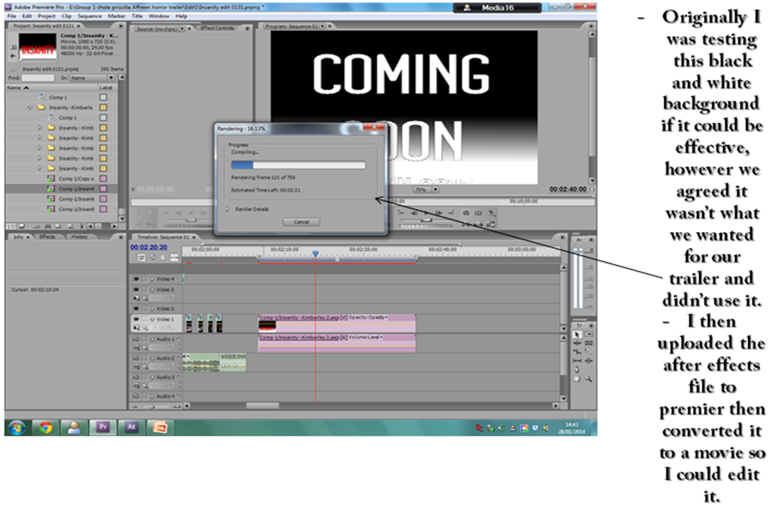
Day 79 : Using Adobe After Effects to develop text used in trailer

Today me and Priscilla took turns using Adobe After Effects to develop and improve text which will feature in our trailer. Below are pictures which represent what we have done within After Effects but also the reasons behind it, e.g using particular effects to reinforce elements within our narrative.
.JPG)
.JPG)
.JPG)
.JPG)
.JPG)
.JPG)


Summary
I have developed my skills using Adobe After Effects throughout the past couple of days. I now know how to put different effects on text, which is an aspect I struggled with last week. In the future I wish to learn how to create motion/animations within the backgrounds of After Effects, even though this particular effect will not be featured in our trailer.
Image of creepy child drawing : http://blog.psprint.com/featured-post/designs-cute-things-evil/
Day 79 part 2 : New dates for our production (20th November)

We decided to choose our film to be released on the 20th November 2015, however originally we were planning to market our release on Father's Day to symbolise Flora's relationship with her father.
When given feedback from our teacher we realised it would be too insensitive to put our release date on Father's Day as it is a time of happiness (and our narrative is dark and unsuited to this day) and choose to do the 20th November instead, which is globally a day to celebrate Children. We agreed as a group that this would be more effective as Flora looks sweet and innocent like other children but really she's strangely mature and twisted.
This date will be featured within our final trailer and poster.
Monday, 3 February 2014
Day 78 : Changing the colour and background of our text

My fellow classmate Kimberly Young introduced me to using text effects on Adobe After Effects. It was easier learning from a peer than YouTube tutorials as they are often daunting, however I did learn elements of text from tutorials but I found the effects tutorials very confusing.


Gong Minji fanart credit to : http://www.deviantart.com/morelikethis/157081590/fanart?view_mode=2
Day 78 part 2 : The creation of our Poster (Insanity)
This post represents the creation in terms of postproduction of our final poster. This slideshow highlights the decisions we made, as well as our development of the poster.
*It is written in first person as Priscilla wrote it
*It is written in first person as Priscilla wrote it
Saturday, 1 February 2014
Day 77 : Editing using Premier & Adobe After Effects
POST-PRODUCTION PROGRESS

I created an image below which presents elements I had edited out of the trailer, but also my
experiences using Adobe After Effects. This week I will continue the editing process by adding finishing touches through text and sound (re-recording voice over as it was muffled). I will continue to post about what I have learnt but also the difficulties I have faced editing.
*Please click on image to make bigger it if too small
Here is a hyperlink to the YouTube tutorial for creating text with effects on Adobe After Effects below

Subscribe to:
Comments (Atom)